"A brand is not just a logo, a website, or a business card—it’s an experience."
-Jeff Bezos
-
Fluent in design tools and brand systems, I bring both creative intuition and technical precision to my work.
• Adobe Photoshop, Illustrator, InDesign
• Figma & UI Layout Systems
• Brand Ideation & Concept Development
• Typography & Color Systems
• Visual Identity Design
• Print & Digital Asset Production
• Social Media Template Design
• Brand Guidelines & Style Systems
• Presentation Design
• Art Direction & Visual Storytelling -
I work across the full branding spectrum—from concept to execution. This includes brand identity, logo systems, digital and print applications, and UI/UX direction. Whether it’s refreshing an existing brand or creating one from scratch, I focus on delivering consistent and thoughtful visual experiences that resonate.
-
Because it feels like raising something from the very beginning. Branding, to me, is like watching a child born from my thoughts and ideas gradually grow, find its own voice, and take shape with clarity. There’s a deep sense of fulfillment in seeing an identity evolve and stand confidently on its own.
zero
ZERO is a pre-launch high-security app focused on encrypted communication. I refined the original logo concept and led the development of a complete brand system—from defining the core color palette and typography to creating a detailed brand guideline. I also established UX/UI standards to ensure consistency across product and marketing touchpoints, balancing functionality with a sleek, trustworthy aesthetic.


reach hydrogen
REACH Hydrogen is a Vancouver-based company committed to clean, renewable hydrogen energy solutions. As the brand designer, I created a modern identity system that reflects their pioneering spirit and sustainability mission. The project focused on clarity, cohesion, and future-forward design across both logo and website.
Project Highlights
• Brand identity design with modern, clean visual language
• Logo concept inspired by movement, clarity, and sustainability
• Website design focused on user experience and green energy storytelling
• Typeface and color palette tailored to evoke innovation and trust
• Delivered a cohesive system applied across print, digital, and web assets


BCLA LGBTQ2+ Interest Group
The rebrand features a vibrant visual system built with rainbow tones and dynamic, varied circles that come together to form a harmonious mandala. This identity embodies the group’s core values of diversity, unity, and joyful representation within the library community.


starry night & H stillery
Starry Night
Inspired by Korean soju traditions and Vancouver’s creative nightlife, I crafted a unique identity for Starry Night. The logo blends modern minimalism with poetic cues, positioning the brand as a local soju that’s both stylish and soulful.
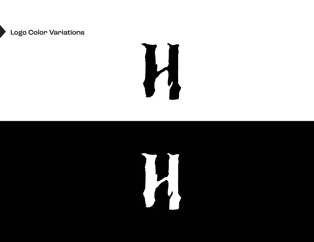
H Distillery
H Distillery is a Vancouver-based vodka producer with a refined identity inspired by traditional East Asian calligraphy. I managed branding project with the new logo merges classical elegance with the depth and texture of ink brush strokes, giving the brand a timeless, artisanal character.


yaacs

For this educator- and leader-focused community within the BC Library Association, I developed a calm, educational visual identity using soft blue tones. In addition to rebranding, I designed a set of social media templates to ensure consistent, approachable communication across digital platforms.

